- Why Words Win
- Posts
- Conversion rate optimization lessons for your PPC landing page hero
Conversion rate optimization lessons for your PPC landing page hero
How folk can turn a good PPC landing page into a great PPC landing page
THE BREAKDOWN
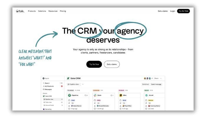
For your consideration, here’s the hero section of the landing page:

Let’s start with what’s working on folk’s PPC landing page:
Clear product category and audience identification.
You know exactly what you're looking at when you land on this page: a CRM for agencies.
The headline quickly answers the crucial questions floating around in the reader’s head, like "what is this?" and "is it for me?". This allows a decision-maker at an agency who is looking for a CRM to quickly self-qualify.

Clarity is also important for messaging memorability. If you’d like to dig deeper, here are some extra resources:
Now, for what I’d optimize:
Tip #1: Prioritize meaningful messaging in the headline.
While the current headline "The CRM your agency deserves" is clear on the product category and who the page is for…
The headline isn’t saying anything particularly meaningful.
Has any agency owner truly thought or wished their agency deserved a specific type of CRM? Probably not. (Also, nearly any competing CRM could slap that headline on their “CRM for agencies” landing page too.)
The subhead offers a little more meaning (at least in terms of the reader’s motivation):
"Your agency is only as strong as its relationships."
This speaks more directly to agency pain points and motivations for choosing (or switching to) a new CRM. For this reason, I’d test that message in the headline, like so:

This headline / subhead modification is at least a starting point to refocus the hero messaging around what seems to differentiate folk and what agencies want from their CRM.
Bonus points: the revised headline also reinforces the “build stronger relationships” message seen in the ad:

(Of course, there are many ways to approach this PPC ad-landing page hero pairing. For example, other approaches might focus on the “simple” / “uncomplicated” approach folk offers or the advantages their LinkedIn chrome extension offers. More detailed messaging research is the fastest way to land on strong hypotheses for the leading messages.)
The main nav on folk's landing page is (unfortunately) somewhat standard, but the goal here is to drive signups, right?
My recommendation is to simplify the navigation.
Ditch the dropdown menus for Products, Solutions, Resources, the pricing link, even the login button. This page revision will help keep the reader laser-focused on either signing up for the free trial or booking a demo.

More resources to dive deeper into conversion-focused navigation for landing pages:
Tip #3: Add a click trigger to reduce risk and increase motivation.
Folk includes some solid trial incentives, like:
No credit card is required during the trial sign-up.
A 14-day trial of the Premium account (which includes advanced tools like email sequences and dashboards).
Unfortunately, the control hero doesn’t mention these incentives at all. (Nor are they mentioned anywhere else on the landing page).
A simple way to reduce the perceived risk of taking action is to place a risk-reducing click trigger under the hero buttons. For example, something like "Get 2 weeks of Premium. No credit card required."
This click trigger gives the reader a clear picture of what they get when they take action and why it's safe to do so (i.e. they won’t get automatically billed at the end of their trial if they forget to cancel).

Want to see more examples of SaaS click triggers? Check out Glance: How to increase conversion using click triggers.
By implementing these tweaks, folk could see a nice bump in trial signups and demo requests.
THE ACTIONABLE TIP
Make all roads CTAs lead to your goal.
Here's the key strategy you can swipe for your PPC landing pages:
Plan your page intentionally. All CTAs should lead to the specific action you want your reader to take.
Here’s how to implement this strategy:
Define your page’s primary goal. In B2B tech and SaaS, this typically means driving sign-ups or demo requests.
Remove any links or buttons that lead away from your goal action. Typically, this means you should keep only the CTAs that drive sign-ups or demos.
Reduce perceived risk and increase perceived value. Risk-reducers include phrasing like "No credit card required" or "Get full access for X days."
Don't let your landing page be the weak link in your conversion chain. Make every click you pay for count.